UX Case Study · HCLTech
Designing for Net Zero — NIO by HCLTech
My Role
Lead UX Designer
Platform
Web — Enterprise SaaS
Team
Product, Engineering, IoT
Status
Shipped · Award-winning

How I shaped the user experience of an award-winning IoT sustainability platform used by enterprises worldwide to monitor, reduce, and report carbon emissions.
Overview
What is NIO?
Net Zero Intelligent Operations (NIO) is HCLTech's enterprise-grade sustainability platform. It connects an organisation's Operational Technology (OT) and Information Technology (IT) systems to monitor energy consumption and greenhouse gas emissions in real time — across entire enterprise estates.
I joined the product at a critical phase: the platform was functional, but the experience for the end users — sustainability managers, operations leads, and C-suite stakeholders — needed to become genuinely intuitive and decision-ready.
The Problem
Enterprise sustainability data was complex, siloed, and hard to act on
Large enterprises are under increasing pressure to meet net zero goals, comply with standards like ISO 50001, GRI, and TCFD, and report Scope 1, 2, and 3 emissions accurately.
Core design challenge
How might we make vast, technically complex sustainability data legible and immediately actionable — for users ranging from shop floor managers to board-level executives?
But the tools available were fragmented — different teams used different systems, data was inconsistent, and turning raw sensor data into meaningful action was a manual, time-consuming process.
Users
Three types of users, very different needs
Sustainability Manager
Operations Lead
Executive / C-Suite
Needs to track emissions targets, run compliance reports, and identify reduction opportunities across sites.
Needs real-time visibility into energy usage on specific machines or areas — and actionable alerts when anomalies occur.
Needs a high-level view of progress toward net zero commitments — clear, presentable, boardroom-ready.

Deliver
Shipped to global enterprise clients
Worked closely with engineering to ensure design quality through delivery. The product shipped to large enterprise clients across manufacturing, energy, and industrial sectors worldwide.
Test
Validating with enterprise users
Conducted usability sessions with sustainability managers and operations leads. Iterated on navigation structure, chart clarity, and alert prioritisation based on feedback. Tested compliance reporting flows against ISO 50001 and GRI requirements.
Design
From wireframes to high-fidelity
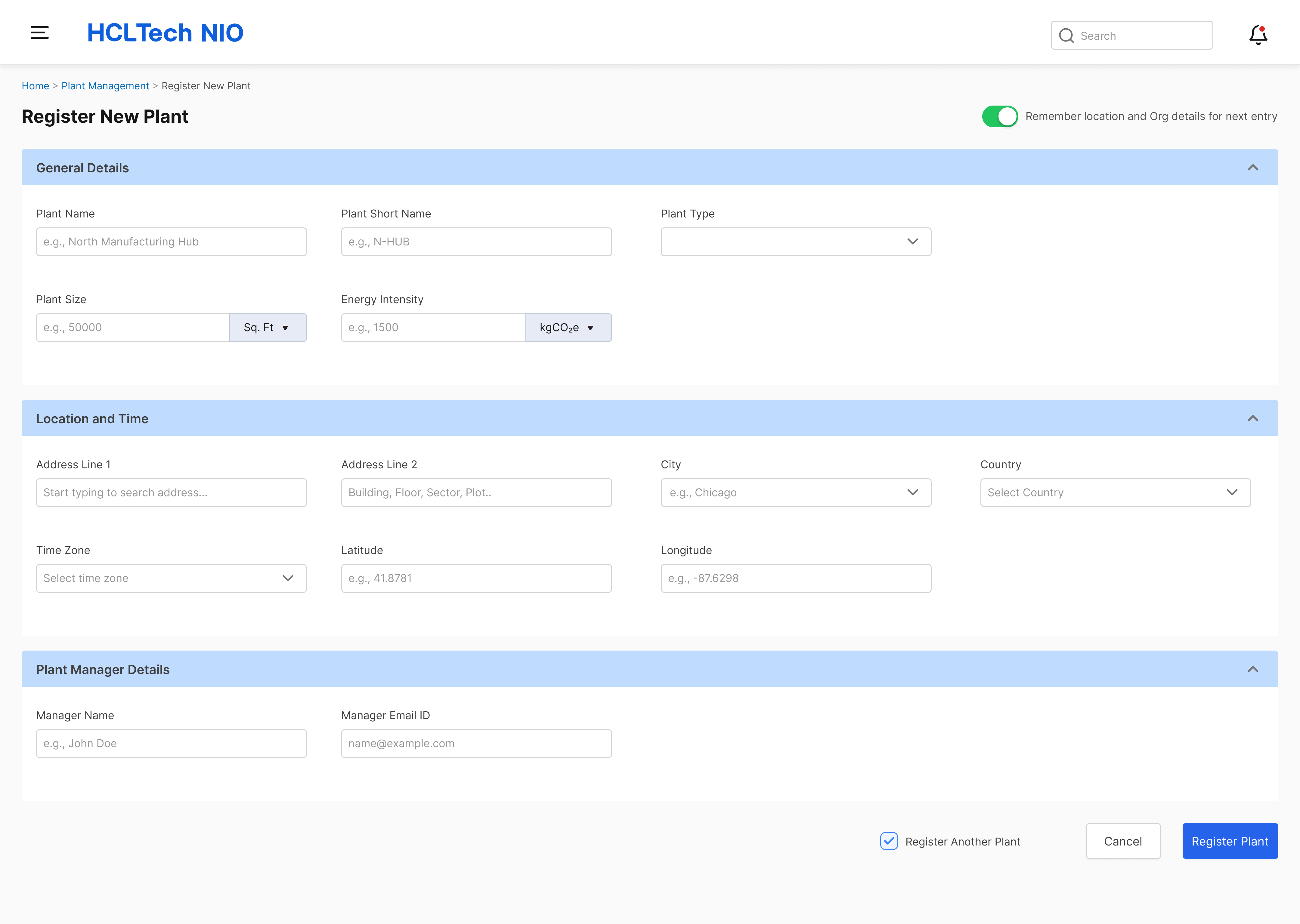
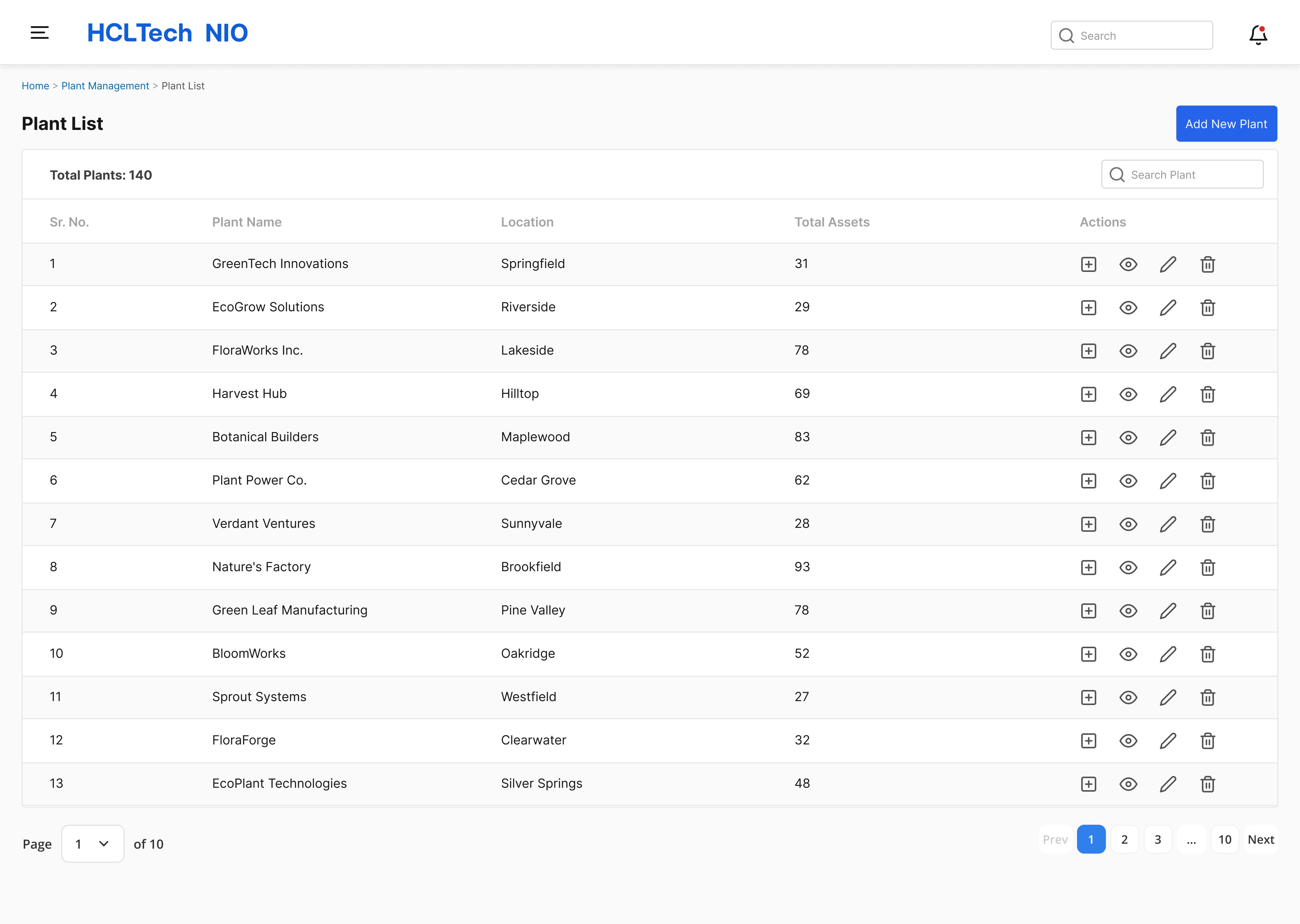
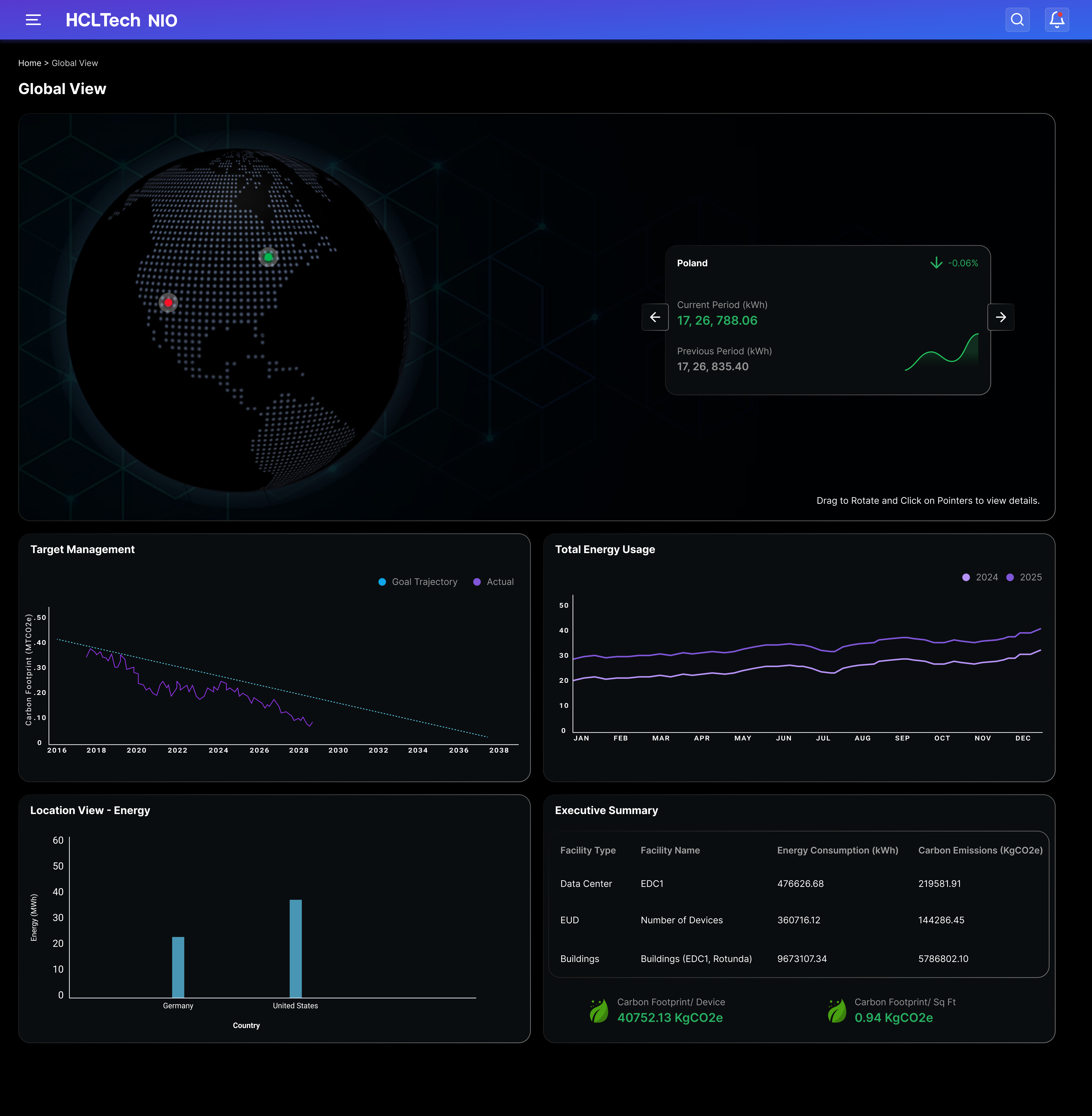
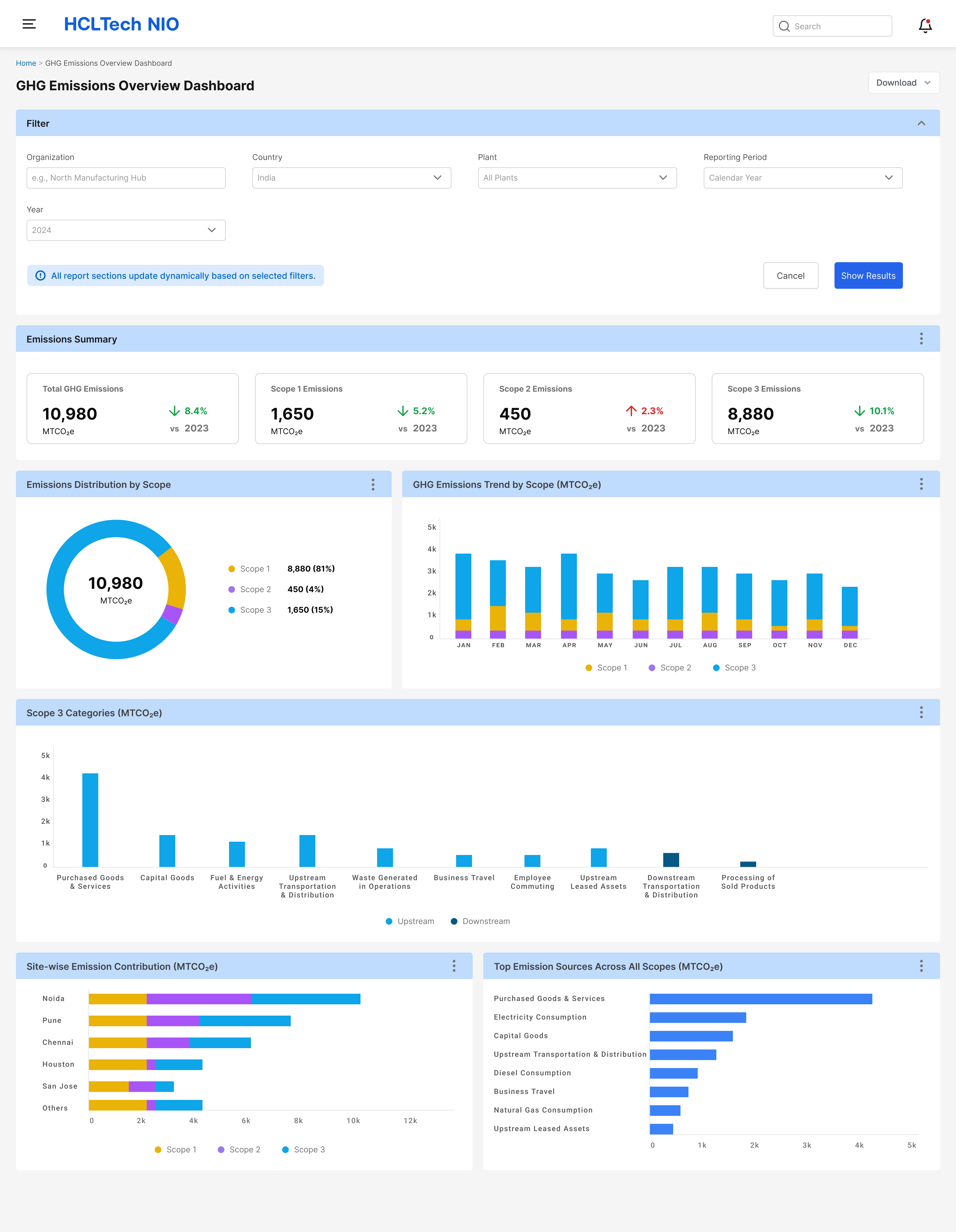
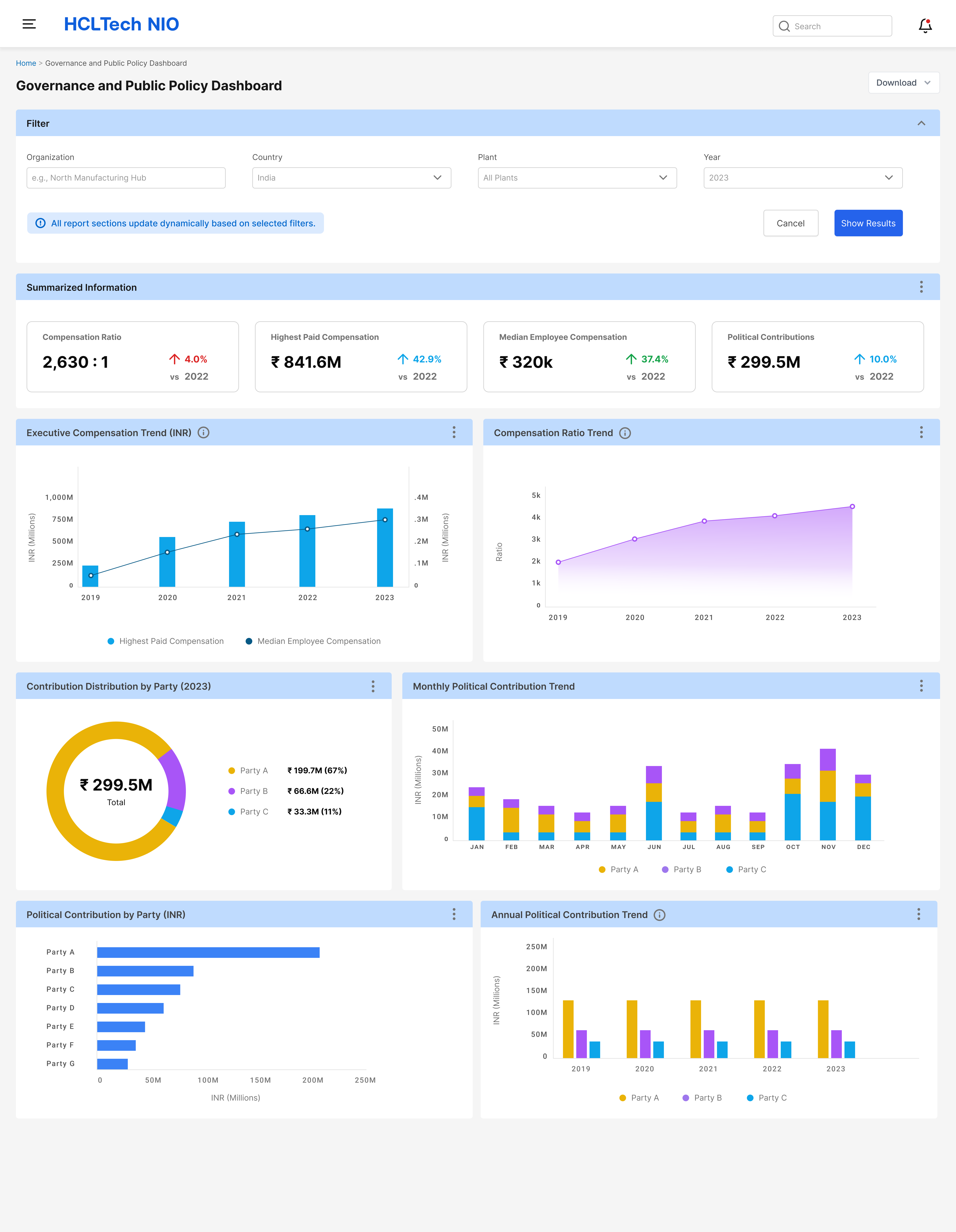
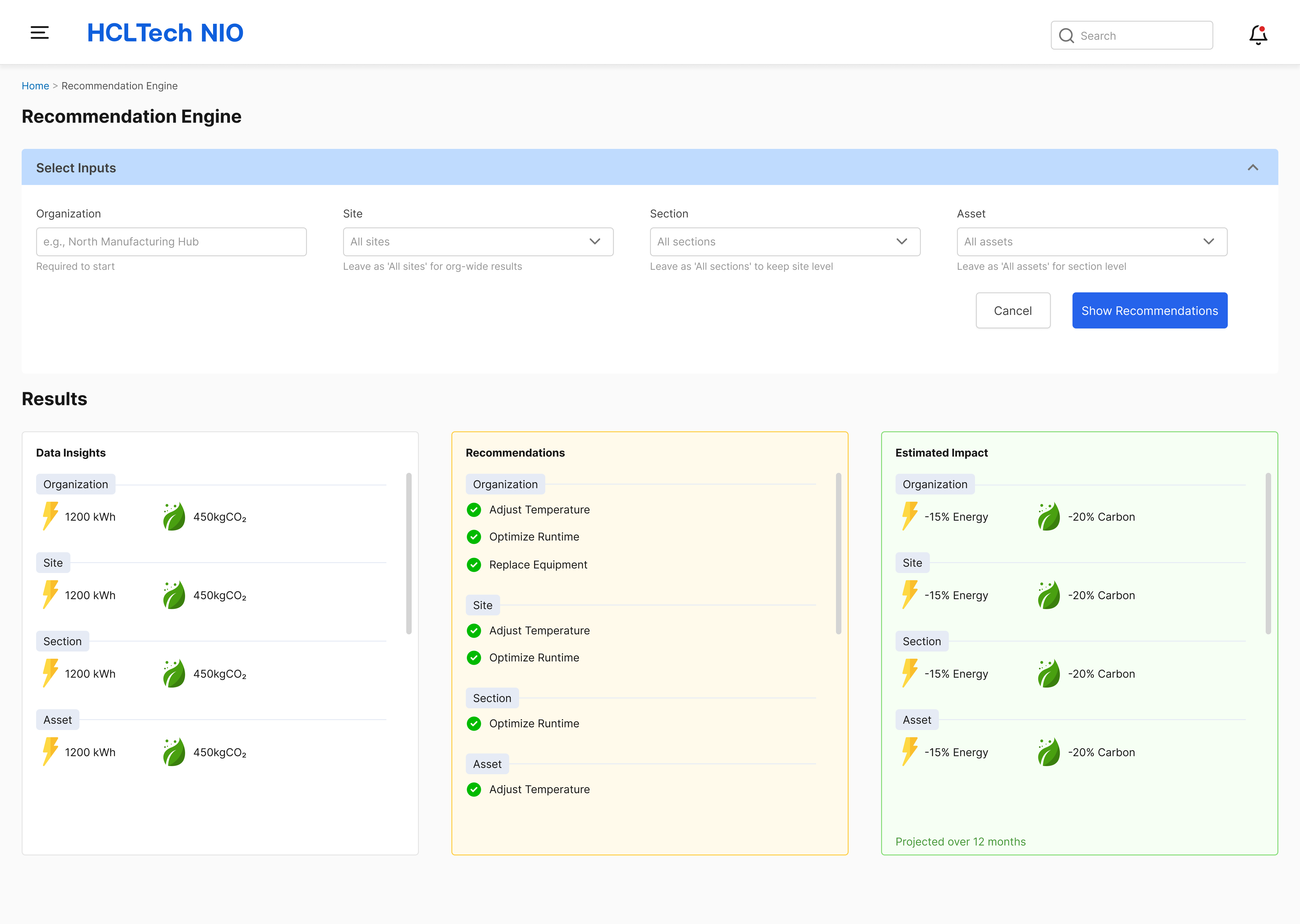
Designed dashboards for different user roles, with progressive disclosure — high-level summaries for executives, granular drill-downs for operations. Developed a consistent data visualisation language for energy, emissions, and KPI tracking across all views.
Define
Mapping user needs to design priorities
Synthesised findings into user personas and journey maps. Identified the critical flows: real-time monitoring, site comparison, emissions reporting, and compliance export. Prioritised reducing cognitive load on data-heavy screens.
Discover
Understanding the domain
Spent time with engineering and domain experts to understand the OT/IT data layer: how sensors fed into the platform, what protocols were used (100+ supported), and how emissions were calculated. Spoke with sustainability and operations stakeholders to understand existing workflows and pain points.
Process
How I worked
Key Design Decisions
Three choices that defined the experience
01
Role-based dashboards

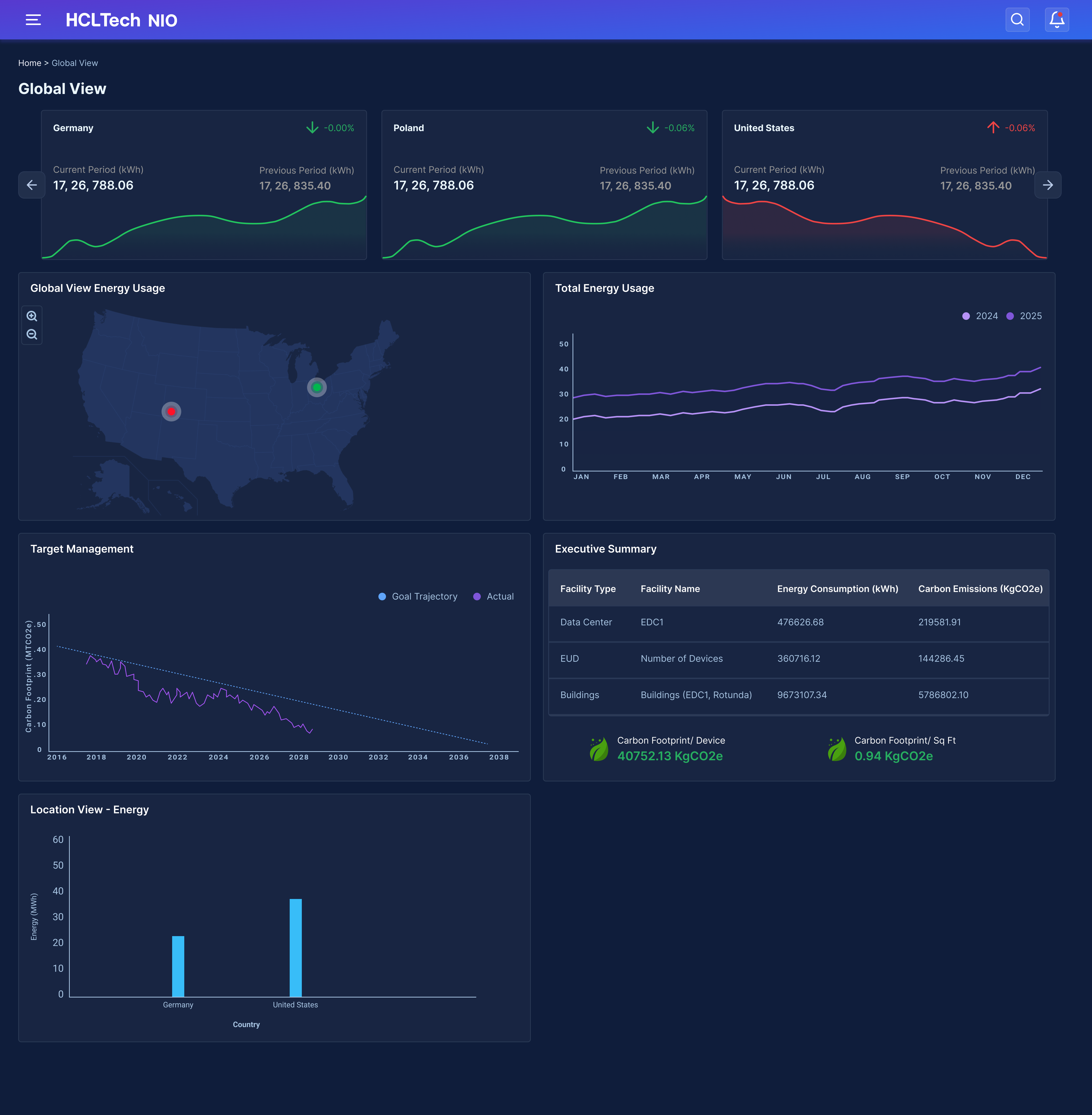
Rather than one dashboard for all users, we designed role-specific views. Executives see an emissions summary with net zero progress. Managers see site comparisons. Operators see real-time machine-level data. The same underlying data, three purposefully different lenses.
02
A unified data visualisation language

With hundreds of data points across energy, emissions, and KPIs, visual consistency was critical. I designed a shared chart system with consistent colour encoding, axis patterns, and tooltip behaviour — so users could interpret any chart instantly without relearning conventions.
03
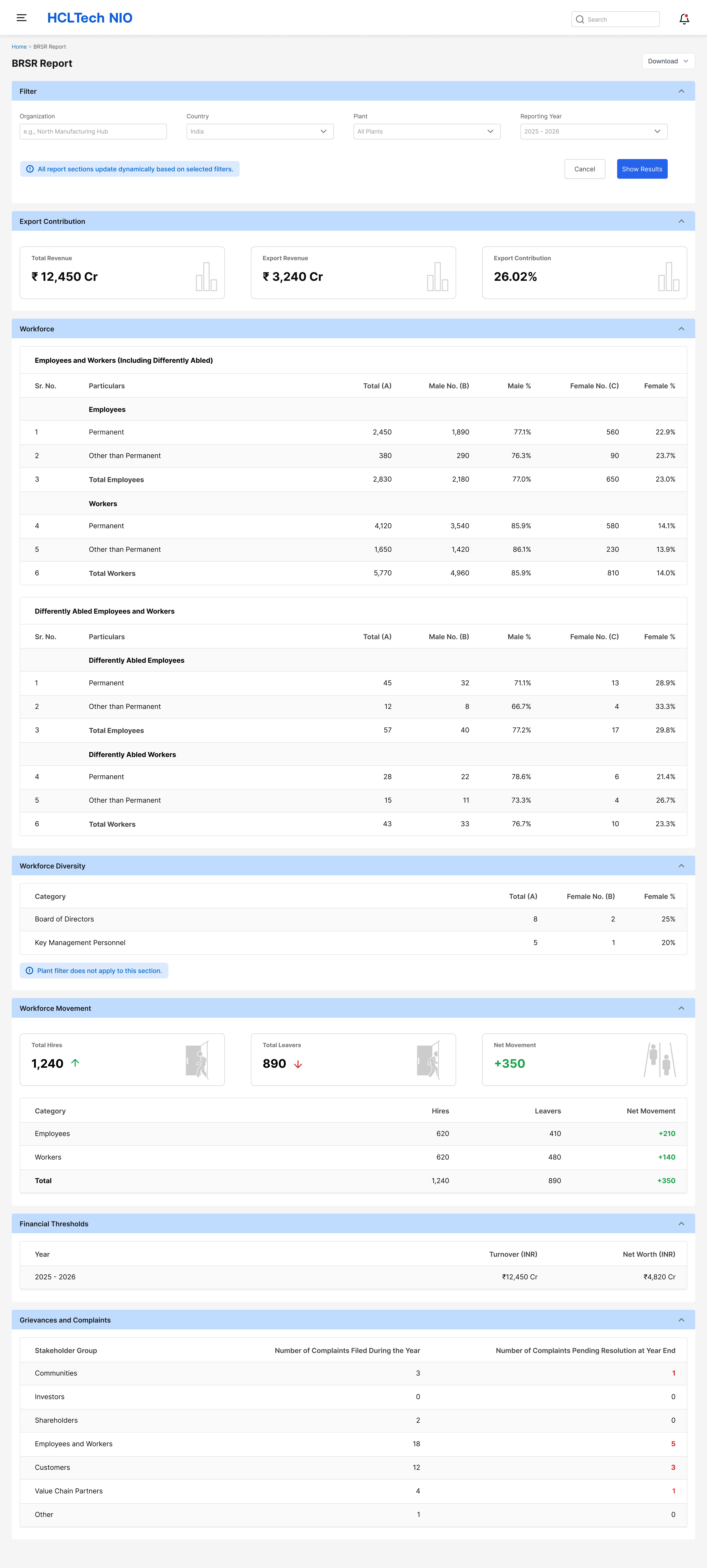
Compliance reporting made simple

Generating reports for GRI, GHG, ISO 50001, and TCFD was previously a manual, error-prone process. I designed a guided reporting flow that mapped platform data directly to compliance fields — reducing report generation time significantly and removing a major source of user anxiety.
Carbon reduction
8–10%
Reduction in carbon footprint per year for enterprise clients
Cost optimisation
6–10%
Improvement in annual operational costs through energy insights
Energy savings
7–10%
Annualised energy savings from rapid optimisation measures
Outcome
Measurable impact at enterprise scale
Beyond the metrics, the platform enabled enterprises to achieve compliance with key sustainability standards including ISO 50001, GRI, and TCFD — removing the manual overhead that had made reporting a quarterly bottleneck.
IoT Evolution Industrial Product of the Year — 2023
Presented by IoT Evolution World magazine
Cisco Global Digital Sustainability Challenge — 2022
Winner of Cisco's global sustainability innovation award
IoT Evolution Business Impact Award — 2023
Presented by IoT Evolution World magazine
Recognition
NIO won multiple industry awards


Reflection
What I learned
Working on NIO was one of the most technically demanding design challenges I've tackled. The domain — IoT, emissions accounting, OT/IT integration — required deep collaboration with engineers and domain experts before I could design with confidence. Learning the subject before designing the interface made every decision more grounded.
The biggest ongoing challenge was designing for complexity without overwhelming users. Enterprise sustainability managers are not data analysts — they need answers, not raw numbers. I learned to lean into progressive disclosure: surface the signal, hide the noise, and make the detail available when needed.
If I were to do this again, I'd invest more time in generative research at the start — specifically with compliance and reporting users, whose needs turned out to be more nuanced than our initial assumptions. The reporting flow was the most iterated part of the product for exactly that reason.